【css】テキストと画像を横並びにするリンクを作る2パターン【スマホ対応】
カテゴリー︎: 【CSS】
テキストと画像を横並びにするhtmlとcss
ゼロから作るのが面倒な人は
さくっとコピペしてお使いください〜
スマホ対応してます。
画像はこの btn.png を使用
↓

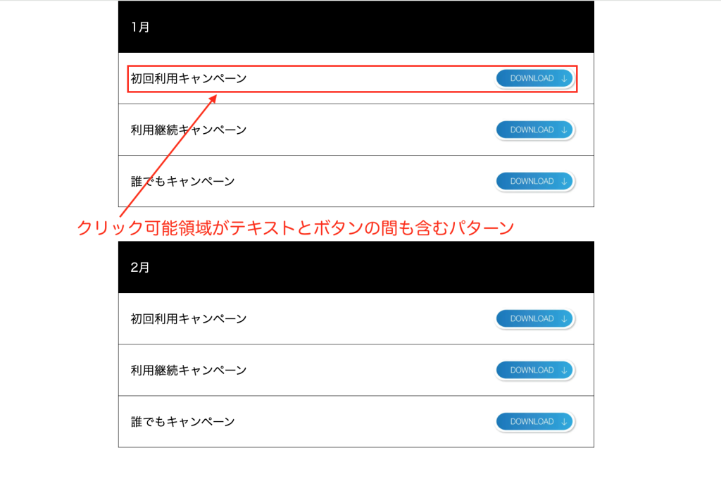
まず、1つ目は
クリック可能領域がテキストとボタンの間も含むパターン(パターン1)
↓
htmlとcss コード(パターン1)
↓
<!DOCTYPE html>
<html lang="ja">
  <head>
    <meta charset="UTF-8" />
    <meta name="viewport" content="width=device-width, initial-scale=1.0" />
    <title>Flexbox Layout 1</title>
  </head>
  <body>
    <style>
      html,
      body,
      div,
      p,
      span,
      a,
      img {
        margin: 0;
        padding: 0;
      }
      .box {
        width: 560px;
        margin: 0 auto;
      }
      /* スマホ */
      @media (max-width: 800px) {
        .box {
          width: 100%;
        }
      }
      .title {
        color: white;
        background: black;
        text-align: left;
        padding: 8px;
        /* margin-bottom: 0; */
      }
      .box_in {
        margin-bottom: 40px;
      }
      .box_in p {
        font-size: 14px;
        border: solid 0.5px black;
        margin: 0;
        text-align: left;
        padding: 14px;
        height: 32px;
        line-height: 32px;
      }

      .box_in p:not(:first-child) {
        border-top: solid 0;
      }

      .box_in p a {
        color: black;
        display: inline-flex; /* インラインフレックスボックスを使用して高さを揃える */
        align-items: center; /* アイテムを中央揃えにする */
        text-decoration: none; /* リンクの下線をなくす */
        justify-content: space-between; /* アイテム間のスペースを均等に配置 */
        width: 100%; /* 横幅100% */
      }

      .box_in p a img {
        height: 100%; /* 親要素の高さに合わせて画像の高さを100%に設定 */
        margin-left: auto; /* 画像を右寄せ */
        margin-right: 5px; /* 画像とテキストの間に余白を追加(必要に応じて調整) */
      }
    </style>

    <div class="box">
      <div class="box_in">
        <p class="title">1月</p>
        <p>
          <a href="#" target="_blank"
            >初回利用キャンペーン<img src="btn.png" width="100" height="auto"
          /></a>
        </p>
        <p>
          <a href="#" target="_blank"
            >利用継続キャンペーン<img src="btn.png" width="100" height="auto"
          /></a>
        </p>
        <p>
          <a href="#" target="_blank"
            >誰でもキャンペーン<img src="btn.png" width="100" height="auto"
          /></a>
        </p>
      </div>
      <div class="box_in">
        <p class="title">2月</p>
        <p>
          <a href="#" target="_blank"
            >初回利用キャンペーン<img src="btn.png" width="100" height="auto"
          /></a>
        </p>
        <p>
          <a href="#" target="_blank"
            >利用継続キャンペーン<img src="btn.png" width="100" height="auto"
          /></a>
        </p>
        <p>
          <a href="#" target="_blank"
            >誰でもキャンペーン<img src="btn.png" width="100" height="auto"
          /></a>
        </p>
      </div>
      <div class="box_in">
        <p class="title">3月</p>
        <p>
          <a href="#" target="_blank"
            >初回利用キャンペーン<img src="btn.png" width="100" height="auto"
          /></a>
        </p>
        <p>
          <a href="#" target="_blank"
            >利用継続キャンペーン<img src="btn.png" width="100" height="auto"
          /></a>
        </p>
        <p>
          <a href="#" target="_blank"
            >誰でもキャンペーン<img src="btn.png" width="100" height="auto"
          /></a>
        </p>
      </div>
    </div>
    <!-- box end -->
  </body>
</html>
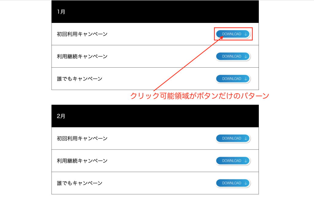
そして、2つ目は
クリック可能領域がボタンだけのパターン(パターン2)
↓
htmlとcss コード(パターン2)
↓
<!DOCTYPE html>
<html lang="ja">
  <head>
    <meta charset="UTF-8" />
    <meta name="viewport" content="width=device-width, initial-scale=1.0" />
    <title>Flexbox Layout 2</title>
  </head>
  <body>
    <style>
      html,
      body,
      div,
      p,
      span,
      a,
      img {
        margin: 0;
        padding: 0;
      }
      .box {
        width: 560px;
        margin: 0 auto;
      }
      /* スマホ */
      @media (max-width: 800px) {
        .box {
          width: 100%;
        }
      }
      .title {
        color: white;
        background: black;
        text-align: left;
        padding: 8px;
        /* margin-bottom: 0; */
      }

      .box_in {
        margin-bottom: 40px;
      }

      .box_in p {
        font-size: 14px;
        border: solid 0.5px black;
        margin: 0;
        text-align: left;
        padding: 14px;
        height: 32px;
        display: flex;
        /* 横並びにするために追加 */
        align-items: center;
        /* アイテムの高さを揃えるために追加 */
      }

      .box_in p:not(:first-child) {
        border-top: solid 0;
      }

      .box_in span {
        flex: 1;
        /* 幅を調整するために追加 */
      }

      .box_in img {
        height: 100%;
        /* 親要素の高さに合わせて画像の高さを100%に設定 */
        margin-left: auto;
        /* 画像を右寄せ */
        margin-right: 5px;
        /* 画像とテキストの間に余白を追加(必要に応じて調整) */
        flex-shrink: 0;
        /* 画像の縮小を防ぐ */
      }
    </style>

    <div class="box">
      <div class="box_in">
        <p class="title">1月</p>
        <p>
          <span>初回利用キャンペーン</span>
          <a href="#" target="_blank"
            ><img src="btn.png" width="100" height="auto" alt="Button"
          /></a>
        </p>
        <p>
          <span>利用継続キャンペーン</span>
          <a href="#" target="_blank"
            ><img src="btn.png" width="100" height="auto" alt="Button"
          /></a>
        </p>
        <p>
          <span>誰でもキャンペーン</span>
          <a href="#" target="_blank"
            ><img src="btn.png" width="100" height="auto" alt="Button"
          /></a>
        </p>
      </div>
      <!-- box_in end -->

      <div class="box_in">
        <p class="title">2月</p>
        <p>
          <span>初回利用キャンペーン</span>
          <a href="#" target="_blank"
            ><img src="btn.png" width="100" height="auto" alt="Button"
          /></a>
        </p>
        <p>
          <span>利用継続キャンペーン</span>
          <a href="#" target="_blank"
            ><img src="btn.png" width="100" height="auto" alt="Button"
          /></a>
        </p>
        <p>
          <span>誰でもキャンペーン</span>
          <a href="#" target="_blank"
            ><img src="btn.png" width="100" height="auto" alt="Button"
          /></a>
        </p>
      </div>
      <!-- box_in end -->

      <div class="box_in">
        <p class="title">3月</p>
        <p>
          <span>初回利用キャンペーン</span>
          <a href="#" target="_blank"
            ><img src="btn.png" width="100" height="auto" alt="Button"
          /></a>
        </p>
        <p>
          <span>利用継続キャンペーン</span>
          <a href="#" target="_blank"
            ><img src="btn.png" width="100" height="auto" alt="Button"
          /></a>
        </p>
        <p>
          <span>誰でもキャンペーン</span>
          <a href="#" target="_blank"
            ><img src="btn.png" width="100" height="auto" alt="Button"
          /></a>
        </p>
      </div>
      <!-- box_in end -->
    </div>
  </body>
</html>
見た目は2つとも同じなので
それぞれのパターンを状況に応じてお使いくださ〜い。