横並び画像配置した上下の余白のバランスをcssでいい感じに調整する方法
カテゴリー︎: 【CSS】
画像を配置したあとに上下の余白設定で
margin-top や margin-bottom
padding-top や padding-bottom
を使いあれこれと調節するかとおもいます
特に2つ以上の画像を横並びにしたときに
うまくいかなかったので、簡単な設定方法をメモします
【解決方法】
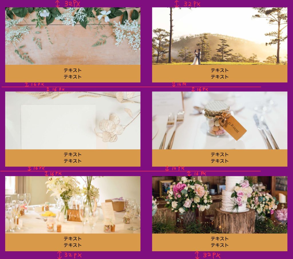
まずは2つ画像を横並びにした場合
今回は divの中に画像を入れている
html
↓
                <div class="img_box2">
                    <div class="box2">
                        <img src="images/wedding_8.jpg" alt="">
                        <p class="box__title">テキスト<br>テキスト</p>
                    </div>
                    <div class="box2">
                        <img src="images/wedding_9.jpg" alt="">
                        <p class="box__title">テキスト<br>テキスト</p>
                    </div>
                    <div class="box2">
                        <img src="images/wedding_10.jpg" alt="">
                        <p class="box__title">テキスト<br>テキスト</p>
                    </div>
                    <div class="box2">
                        <img src="images/wedding_11.jpg" alt="">
                        <p class="box__title">テキスト<br>テキスト</p>
                    </div>
                    <div class="box2">
                        <img src="images/wedding_12.jpg" alt="">
                        <p class="box__title">テキスト<br>テキスト</p>
                    </div>
                    <div class="box2">
                        <img src="images/wedding_13.jpg" alt="">
                        <p class="box__title">テキスト<br>テキスト</p>
                    </div>
                </div>
css
↓
.img_box2 .box2 {
  width: 46%;
  margin: 16px auto;
}

.img_box2 .box2:first-child,
.img_box2 .box2:nth-child(2) {
  margin-top: 32px;
}

.img_box2 .box2:nth-last-child(2),
.img_box2 .box2:last-child {
  margin-bottom: 32px;
}
(1) .box2 全部に margin-top と margin-bottom 16pxを設定
(2) 最初と2つ目の .box2 に margin-top: 32px; を設定して上書き
(3) 最後と最後から2つ目の .box2 に margin-bottom: 32px; を設定して上書き
続いて
3つ画像を横並びにした場合
html
↓
                <div class="img_box3">
                    <div class="box3">
                        <p class="box__title">テキスト<br>テキスト</p>
                        <img src="images/wedding_8.jpg" alt="">
                    </div>
                    <div class="box3">
                        <p class="box__title">テキスト<br>テキスト</p>
                        <img src="images/wedding_9.jpg" alt="">
                    </div>
                    <div class="box3">
                        <p class="box__title">テキスト<br>テキスト</p>
                        <img src="images/wedding_10.jpg" alt="">
                    </div>
                    <div class="box3">
                        <p class="box__title">テキスト<br>テキスト</p>
                        <img src="images/wedding_11.jpg" alt="">
                    </div>
                    <div class="box3">
                        <p class="box__title">テキスト<br>テキスト</p>
                        <img src="images/wedding_12.jpg" alt="">
                    </div>
                    <div class="box3">
                        <p class="box__title">テキスト<br>テキスト</p>
                        <img src="images/wedding_13.jpg" alt="">
                    </div>
                </div>
css
↓
.img_box3 .box3 {
  width: 30%;
  margin: 16px auto;
}

.img_box3 .box3:first-child,
.img_box3 .box3:nth-child(2),
.img_box3 .box3:nth-child(3) {
  margin-top: 32px;
}


.img_box3 .box3:nth-last-child(2),
.img_box3 .box3:nth-last-child(3),
.img_box3 .box3:last-child {
  margin-bottom: 32px;
}

(1) .box3 全部に margin-top と margin-bottom 16pxを設定
(2) 最初と2つ目と3つ目の .box3 に margin-top: 32px; を設定して上書き
(3) 最後と最後から2つ目と最後から3つ目の .box3 に margin-bottom: 32px; を設定して上書き
このようにして疑似クラスで簡単に対応できました!
バランスも良い感じです
【まとめ】
要素名:first-child
1番最初の要素にスタイルを適用
要素名:nth-child(2)
2番目の要素にスタイルを適用
要素名:nth-child(3)
3番目の要素にスタイルを適用
要素名:last-child
1番最後の要素にスタイルを適用
要素名:nth-last-child(2)
最後から2番目の要素にスタイルを適用
要素名:nth-last-child(3)
最後から3番目の要素にスタイルを適用
こんな感じで、もし横並び画像が4つ、5つに増えても対応できますね!